

Most credit advertising exec Fred R. Barnard with the line, “A picture is worth a thousand words.” He was writing in a 1921 ad-trade journal, trying to encourage his colleagues to use more illustrations. Another artist (Leonardo da Vinci, 400 years earlier) noted that a poet would be “overcome by sleep and hunger before [being able to] describe with words what a painter is able to [depict] in an instant.”
I can’t imagine that either man was talking about comprehending complex data, but they could have been. Indeed, their pronouncements are more relevant today than ever. Have you seen a single television newscast recently that didn’t use a graphic to show a hurricane’s track or feature a chart on the up/down price of gasoline.
Maps from 5,000 years ago were probably the first practical use of data visualization, but many credit Michael Van Langren, a Flemish astronomer, with providing the first visual representation of statistical data in 1644 (that fact may pop up on “Jeopardy” some night). Van Langren’s charts were not particularly relevant to casinos, nor were the accomplishments of the dozens of other folks who came in between.
But in 1979, Harvard students Dan Bricklin and Bob Frankston did produce something that was wonderful for the gambling industry. They produced amazing software called VisiCalc for the Apple II computer. It was one of the first electronic spreadsheets and later gave birth to other variants, such as Lotus 1-2-3, Numbers, and Microsoft’s popular Excel. For the first time, a casino manager could not only create dynamic data tables, but also quickly produce visual charts without the aid of a programmer, accountant, and/or art department.
The results were amazing. Simple year-over-year line graphs of casino key performance indicators (KPI) were just the beginning. While major trends are obvious without charts, the small peaks and valleys were hiding opportunities. Three-day holidays are always big revenue days, but not everyone noticed that the weeks before and after were unusually depressed. Those minor dips on the chart indicated promotional possibilities and, more important, identified times for staff optimization that had been overlooked.
Another advance in visualization was when programs began grabbing data from various sources. Dispatching software from vendors like CIS Technology plotted team members on the floor (from the Time & Attendance software) against actual slot machine events (“Jackpots,” “Hand Pays” and “Change Lights” from the main Slot System). For most operators, the first pass at this type of chart showed major inefficiencies, with too mch staff when events were slow and not enough during peak periods. By adjusting schedules and staffing to align the graphs, service times were reduced and guest satisfaction scores improved substantially, all without any increase in labor costs. The data had always been there, but it often took a simple visual chart, like “Service Time Efficiency Analysis” to realize the potential.

Spreadsheets also produced an abundance of tables and reports. Slots could be listed and sorted by denomination, coin-in, hold percentage, actual win, theoretical win, manufacturer, location, handle pulls, age, machine type, tracked play, jackpots, lease status, progressive increment, cabinet, and several other KPI. And you could select any combination or grouping of those line items.
Better yet, formulas were easy to add. You could now convert KPI to percentages or any other type of comparison. Dutch computer scientist Edsger Dijkstra validated that thought in 1994 by modifying our introductory phrase, “A picture may be worth a thousand words. A formula is worth a thousand pictures.”
Formulas do fantastic work, but in the end, they produce even more data to be considered in context of the stack of information that continues to grow more massive. With more formulas, the need for greater understanding only grew.
On a spreadsheet, just as important as the formula-generating “Insert Function” is the “Conditional Formatting” command. This allows users to highlight selected data conditions with colors. As an example, machines that win 20% or higher than average could be highlighted in green, while those 20% or lower below average could be shown in red.
Simply sorting a table can show the same thing. But not when it gets complicated. Would you notice a “green” machine in the graph above that also had a suspiciously high “Free Play Redemption” that was listed way to the right in Column 12? You could certainly run 12 reports, each sorted differently. But it would be much more productive if you just highlighted in purple those machines in any column with unusual readings. You’d spot the potential problems instantly. That would be hard to do with 12 reports on hundreds, or thousands, of machines.
Color, done right, is an amazing tool for examining data, even for rocket scientists. NASA’s Robert Simmon recently wrote, “Color selection in data visualization is not merely an aesthetic choice, it is a crucial tool to convey quantitative information. Properly selected colors convey the underlying data accurately, in contrast to many color schemes commonly used in visualization that distort relationships between data values. Judicious use of color also allows multiple datasets to be layered together, which helps to create graphics that tell stories of cause and effect.” Indeed, someone needs to pay attention ASAP to those machines highlighted in “purple” described in the example.
As mentioned, maps have been around for centuries. As I was writing this story, my earthquake app beeped, alerting me to an M3.2 quake 55 km South of Whites City, New Mexico. I had no idea where that was (apologies to my New Mexico friends). But once I clicked on the interactive map, I discovered the shaker was not actually in New Mexico, but rather in the northwest notch of Texas halfway between El Paso and Odessa. And since most USGS maps mark quakes with circles that are bigger or smaller sized by their magnitude, I learned at a glance that there’d been a lot of quakes in that location, many bigger than 3.2, some smaller. A simple map visualization put things in excellent geographical, geological, and chronological and historical perspective (no words required).
Moving from earth shakers to casino floors, the first generic computer-assisted design programs (CAD) appeared in the 1970s. It took more than two decades for them to show up in gaming. IGT was one of the first suppliers to offer professional CAD services to its customers. Instead of using glue sticks and paper cutouts, casino managers could now have IGT generate digital maps of their slot floors with basic colored data used to define denomination, manufacturer, and game type. IGT used the architectural software tool, AutoCAD. It’s wonderful software, but difficult to learn and harder to master.
Casino Data Imaging saw an opportunity, introducing Casino CAD in the late ’90s. As Adam Winkler, CDI’s product manager related, “We made our software as approachable as a video game, rather than a complicated CAD program.”
Their first versions used one-dimensional rectangles to represent slots and five or six colors to outline the machines by various KPI levels. It was revolutionary.
CDI remains a strong design and analytical package today. However, their simple boxes are now renderings that provide a three-dimensional view of the casino floor that can convey true spatial awareness (example below). They also found that their CAD product could reflect not only physical characteristics, but also data.

It is difficult to single out one product, among several good ones, that have emerged in the last 20 years. However, when it comes to cutting-edge casino-data visualization, today’s Quick Custom Intelligence (QCI) represents the latest. It could also be considered the “patient zero” of the many casino-analytical graphics products. That’s because all the leading ones (with the exception of CDI) have their roots with early New Zealand software developers Andrew and Paul Cardno.

Their first gaming product in 1999 was for Crown Casinos. Shortly thereafter, Andrew became the better known of the two brothers when he moved to the U.S., became a citizen, and launched a company known as Compudigm in 2000. That product later was acquired to become Bally Live Floor View. Cardno then founded Viz Explorer in 2007. Viz advanced data images even more. After a short break away from casino gaming, he and mathematician Dr. Ralph Thomas started QCI in 2020.
All of these products featured contour mapping of data on the slot floor. His team used a technique that looked like heat signatures from an infrared camera. Larger flares (or contours) meant stronger performance. While CDI originally used just a handful of colors to indicate intensity, Compudigm and its successors used both size and color. You could instantly recognize slot performance visually. Instead of indicating a machine that was in the colored $100 to $250 range, you instantly visualized where the machine was within that range by its shape and size. There’s a big difference between $105 and $237 in performance. Cardno says, “Contour methods (as shown in the below graphic) increase the observable density by a factor of 10x to 100x. Contour methods also allow for very fine grain comparisons (not the broad buckets of color maps).”
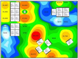
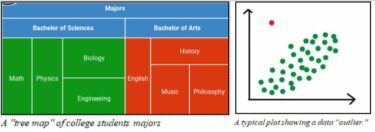
For the first time, you could see and sense those numbers closely without labels. Compudigm also brought other visualizations from the world of data science like “tree maps” and “outlier” plots (two non-gaming examples are shown below).
These visualizations represented a breakthrough in rapid understanding of slot performance. With recent technology improvements in both computer hardware and database software, the latest version of QCI can produce complex visual renderings in milliseconds. The original Compudigm program often took minutes, or even hours, to do the same. At the press of a tab, you can change KPIs from “Coin In” to “Net Win Less Free Play” to almost anything else instantaneously. Or you can display them simultaneously with, or without, any selected labels.
These methods can also produce animations that show how contours can change hour-by-hour. These “movies” are invaluable when analyzing the impact of restaurant hours, promotional activity, staff allocations by location, or understanding trends near select venues.
Like the CDI philosophy mentioned above, making the process easy to learn and easy to use was a paramount design consideration at QCI. As Cardno explained, “Years ago, we spent most of our time doing the really difficult things like computer mapping, but we’ve learned there’s real value in doing some of the simple things.”
A good example is QCI’s exporting to Excel. Virtually every casino system or analytical package has an export function. But QCI takes the time to automatically format that exported data, providing proper column labels, widths, formatting and (most importantly) does “conditional formatting” to make those spreadsheets visually impactful with color coding of selected KPIs.
One slot expert said, “Visualizations don’t give you the answers to everything, but they always show you the right questions to ask.” With good images, spotting a machine with a performance problem stands out quickly like the simple example shown with a Blue/Lt. Blu contour in the middle of a stronger performing bank.

Another major breakthrough in slot analytics in the last decade was combining player data with machine stats. Suddenly, new KPI (like player demographics) could be added to a machine’s profile. It was then possible to measure things like how long players spent on a machine, how much free play was used, how often they returned, etc. That data was priceless to slot directors, but even more so to marketers and hosts. Programs like QCI could show casino plots of where VIPs played, maps indicating how far they traveled to the casino, where they were on the floor in real time, and dozens of other valuable visualizations.
Data today can also be imported from F&B systems, the hotel desk, the golf course, valet parking, showrooms, and the gift shop. The possibilities are almost endless.
For those without advanced software like QCI, some tools beyond spreadsheets can provide the ability to produce meaningful visualizations on your own. One of the best is Tableau, created in 2003 by Stanford researchers Christian Chabot, Pat Hanrahan, and Chris Stolte. In 2019, they sold their product to data giant Salesforce. It wasn’t created specifically for gaming, but can be used in any data-analysis field.
Like AutoCAD, there is a bit of a learning curve with this powerful software, but many have found it useful to create visual dashboards and graphics for casino data. Companies like Bally Systems and Eilers & Krejick have incorporated Tableau outputs in their base products. CDC Gaming Seminars is offering a “Using Tableau for Player, Slot and Table Games Data Analysis” class in late October, taught by analyst Will Dunn.
As mentioned earlier, easy-to-use is a key with all these programs, but so is training. This is one of the most cost-effective expenditures a casino can make. And just as important is keeping software, maps, and users up to date. New features, bug fixes and security patches are extremely important and worth making the latest upgrades a priority. Some vendors have now made unlimited training, upgrades and change requests part of their monthly support fees with no additional charges. This is an important question to ask when researching any package.
The future may provide an even clearer picture. Emerging techniques in database technology, faster hardware, business intelligence and graphical query tools mean answers could come quicker and with more detail. Putting that new data in perspective will always be easier with well-crafted images.
In summary, “A picture has always been worth a thousand words. And a good data visualization can be worth thousands and thousands of unrealized dollars from a casino floor.”
You can find links to the products mentioned in this story by Googling: Microsoft Excel, Apple Numbers, Casino Data Imaging, CIS Technology, Bally Live Floor View, Viz Explorer, Quick Custom Intelligence (QCI), Tableau, and CDC Gaming Seminars.