Every October, the G2E show floor becomes a visual personality test for brands. You can spot the ones that know who they are and the ones that just lost a six-week internal debate about what “fun but elevated” means. You can practically feel the emails in the carpet.
A lot of booths look like peace treaties. You can tell when marketing fought the good fight and lost somewhere between the second creative review and the CFO’s “what if we made it blue?” feedback. That’s how you end up with a booth that technically checks every box and still has no pulse.
Rebranding is one of those projects that always sounds exciting at first. The first meeting is full of optimism and color palettes. Everyone’s still friends at that point. By the third, someone’s reading from a brand-archetype deck and you start to realize half the room is redefining words like “modern” and “authentic” in real time. That’s how good ideas slowly get redesigned into polite ones and somewhere along the way, the work starts serving the process instead of the story.
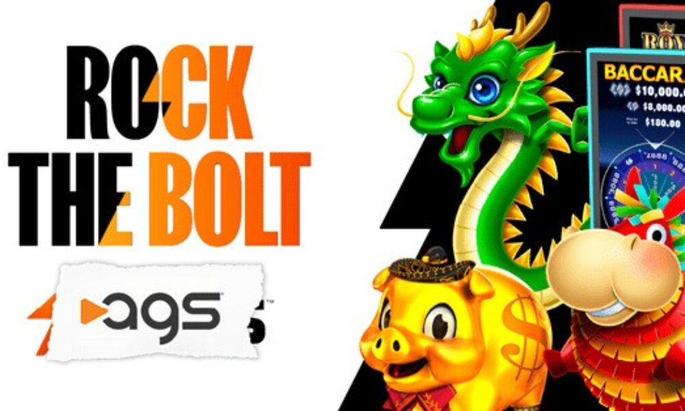
AGS managed to avoid that trap this year. The company unveiled a refreshed look at G2E with a sparkly new logo and sharper design language, but it still felt like them. Nothing about it screamed “new era” or “fresh identity.” It just looked like a brand that finally cleaned its house, without changing the address.
Their “Rock the Bolt” booth leaned into that same self-awareness. It looked like a working recording studio, complete with meeting rooms designed as sound booths and a front merch counter that could have been at a concert venue. Along one wall were cubbies for employees, each filled with their favorite albums, Taylor Swift next to Tupac, Biggie beside Andre from Outkast. You could pull a record, drop it on the turntable, and feel the marketing team collectively praying no one picked Nickelback.
AGS’s booth worked, because it showed restraint. The team kept what worked, refined what didn’t, and trusted the creative process instead of the group chat. Every marketer knows how easily a rebrand turns into a committee project. This one didn’t. It was proof that alignment beats volume.
Here’s what it showed:
Start with what’s already true. Figure out what people already recognize and build from there.
Design the story, not the stage. If it doesn’t mean something, it’s just decor.
Keep the table small. Too many opinions make beige.
Don’t mistake volume for vision. The clearest brands don’t need to shout.
There’s always a temptation to overdesign identity, to polish it until it disappears. AGS resisted that instinct. In the end, every rebrand comes down to self-awareness. AGS knew who they were and that clarity did the talking.


